Brief: People always say money doesn’t buy happiness – yet our actions often confuse this. As a society we have drawn a clear association between money and power, but is it money that gives us power or money that has the power over us? Explore the ways that we are controlled within our capitalist society.
As with always, I started by creating a Pinterest board to start triggering thoughts and ideas. I looked closely at pieces that used physical bank notes as I think that these are the most powerful – which is something I would like to take further.
Contextual Research
From my own perspective, it is clear to me that as a society we are controlled by money – and that those with more money simultaneously also have more power. I wanted to understand where this originated from and how strongly it stemmed within society and so began to research this.
The Archbishop of Canterbury raised an interested point that, although Christianity tendes to see money as the root of all evil, it is only bad when we ourselves let it impact our identity and our relationships – which I fully agree with.
One of the articles I looked at, linked below, explores the stereotypes that money brings with it, subconsciously causing resentment towards those that have it. This is perpetuated in the media with the rich often portrayed as lazy and undeserving and the poor as hard-working and diligent. A topical example of this is the recent college admissions scandal within America right now – where wealthy celebrities have been found out for paying to sneak there children into top colleges – showing the way that the elite forcefully remain in control.
I think money gets its control from its glorification within the media, and the brainwashing effect that this has on influential viewers. Pop songs and particularly rap songs portray money as sexy, with singers flaunting there material possessions. This is also a recurring theme within television with young girls everywhere mimicking the styles of the Kardashians or dreaming of becoming a rich housewife. the media perpetuates the association between money and success, which I think is a really unhealthy view held so tightly within society.
Sources of Info:
https://www.weforum.org/agenda/2017/01/why-we-need-to-rethink-our-relationship-with-money/
https://thriveglobal.com/stories/if-you-think-money-does-not-control-you-read-this/
Artist Research: Hal Hefner
Hal Hefner is an American pop artist most well known for his bold and political ‘Consume’ series, that are based off the 1988 film ‘They Live’, a film which draws light on the evils of consumerism. Like in the film, Hefner depicts recognisable people redesigned to look like the aliens, alongside the powerful tagline ‘Consume’. Amongst his work, he features celebrities such as Kim Kardashians, members of the royal family, and political figures – indicating the way that as a society we are too eager to merely absorb the information that others tell us, rather than think for ourselves. By depicting these modern figures Hefner shows the ways that the daunting messages from ‘They Live’ are still fully relevant within a modern context.


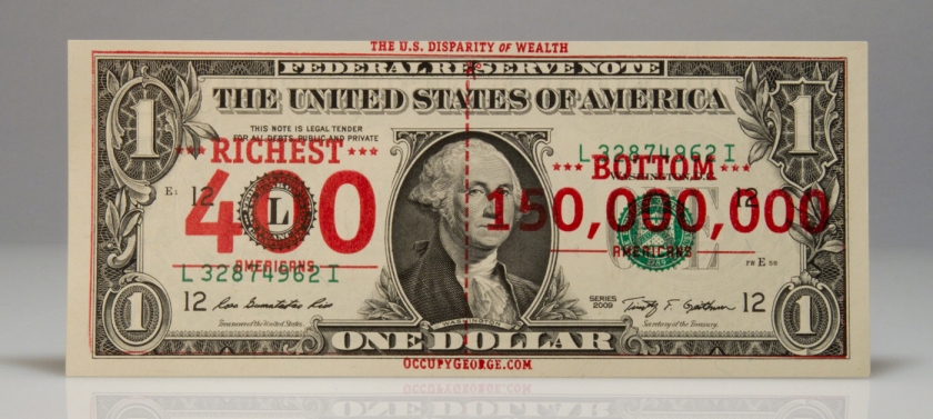
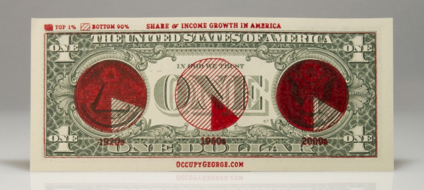
Artist Research: Occupy George Campaign
Website: http://occupygeorge.com/
Money talks, but not loud enough for the 99%. By circulating dollar bills stamped with fact-based infographics, Occupy George informs the public of America’s daunting economic disparity one bill at a time. Because
moneyknowledge is power.
‘Occupy George’ graffitis old dollar bills with diagrams and drawings that put the disparity of wealth within America into easy to understand, shocking visuals in order to protest the way that we as a society are controlled by money, and emphasising the way that those with less money simultaneously have less control. I like the physical form of this protest, and the long reaching effect that these bills can have when placed into circulation – this is a really simple yet clever technique of rebelling against systematic control which I feel is more likely to catch people’s attention than a poster or advert that states similar facts – especially within a modern context with photo sharing sites like Instagram making interesting pieces like this go viral.
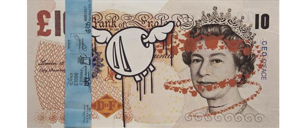
Artist Research: D*Face
The designs of ‘Occupy George’ reminded me of the work of D*Face, an urban contemporary artist who specialises in rebellious graffiti and defacing objects such as bank notes – hence his name. D*Face’s most well known pieces are his collection of defaced bank notes, which draws over the Queen’s head to instead portray her as a skeleton. To me, this work is really powerful – possibly criticising the outdated nature of the monarchy or the concept of money itself. I find it interesting to note that the act of vandalising these dollar bills in this way is actually a criminal offence, punishable by imprisonment – which shows the large emphasis we place on money within our society, and the control that we let it place on our everyday lives. To me, this poses the question that if art is a force for good, that enriches our lives – what is it about money that means we shouldn’t be able to create art upon it in the way we can with almost every other object. I personally do not like to be controlled in this way.
Questionnaire:
Before beginning the creative side of the concept I created and distributed a questionnaire asking my peers on their thoughts on control and their relationship with money. i did not get very many responses for this questionnaire so if it was more important to me I would rethink my distribution method in the future.
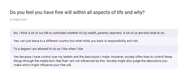
From the questionnaire, it is apparent that most people recognise that certain areas of our lives are controlled but indicating varying levels. I particularly disgaree with the statement ‘you can just leave to a different country’ as the money of merely migrating costs money as well as the physical restraints of the visa’s.
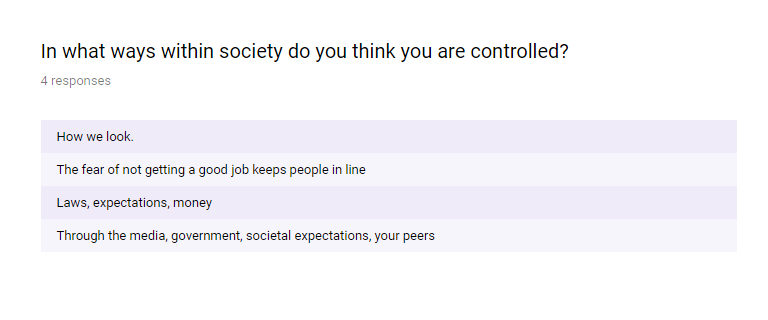
A lot of these seem to link either directly or indirectly with money, showing its high level of control over many different areas within society.
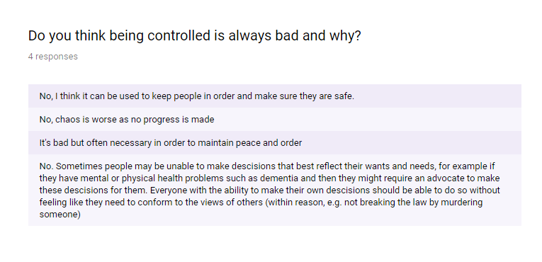
the answers given in this question actually chnaged my own perspective on control, now seeing tat there are positives to not having full free will. This makes me think of the carnage of ‘The Purge’ films, where the lack of laws for one night leads to intense and scary murders and robberies.
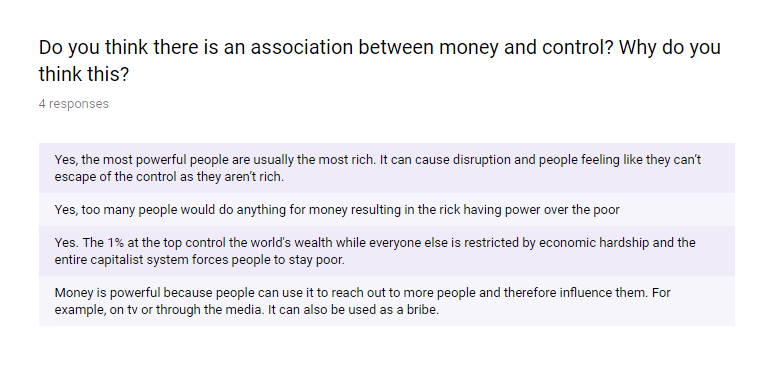
Most people are aware of the control that money gives people so this is an area I could go on to critique, as I feel although people are aware of this, it is not being actively challenged – which is something I seek to do.
These responses also confirmed by beliefs that the media perpetuates the control that money has on us.
From these responses it is clear that money can either enable or prohibit – depending on whether you have it or not. As humans we do not like to be told we can’t do something and so seek to have more money to avoid this. Although money is bad in that it is a controlling force, it is essential in order to survive within our society and so the concept can not easily be removed.
Experimentation:
I started the experimental stage of my project by using the scanner to produce a series of scannograms of money.


This is a technique I have not used before but was relatively easy to do. I started by producing still scans of loose change, notes and cards – that may prove useful in later designs. I like the detail that this method captures – all the intricate crumples and stains which will increase the authenticity of my later designs.
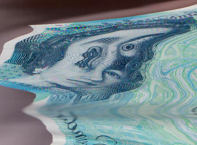
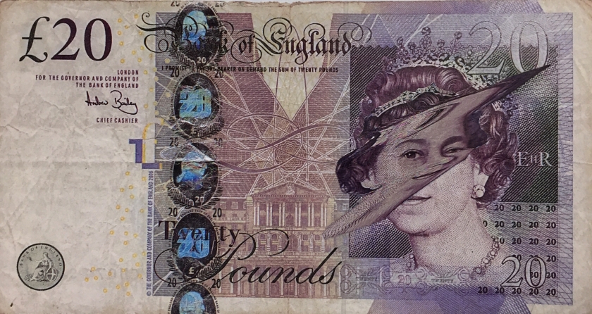
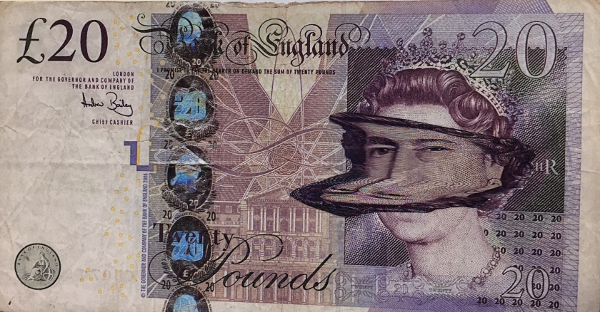
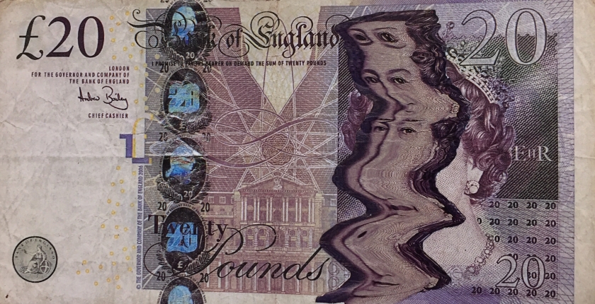
I also produced a series of motion scannograms – in which I moved the notes during the scans to produce the wavy, ripple effect evident below. I think the distortions this has created, in both the queen’s face bbut also the background imagery of the notes, are really interesting. I could possibly use this notion to echo the distorting effect that money has over us, controlling our everyday lives.


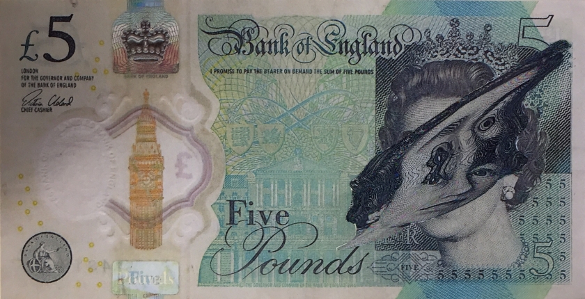
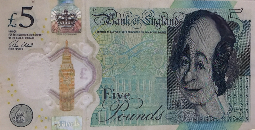
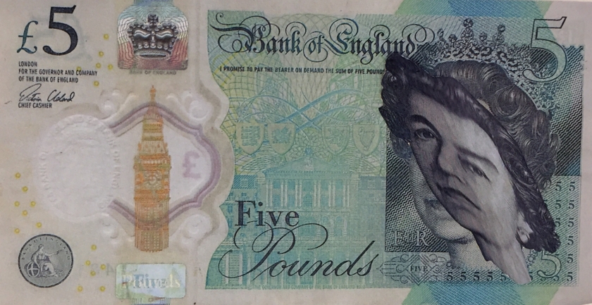
I decided to focus in on the queen’s head as a symbol of the control that capitalism has over us. The scans twisted her face in all different directions – I particularly like the ones that draw attention to the queen’s hypnotic gaze watching the viewer, which I think will link very closely to the message I want to communicate within my designs.


I like the strong colours that the scanner picked up within the note, especially when accentuated via Photoshop, and the way the moves caused the coloured lines to dance into each other.
I then separated the queen’s head, placing them on plain white backgrounds in order to accentuate the features of the head. This also emphasises the grainy lines of the faces which I feel adds to there distorted nature. Removing the background allows me to play around with typography in a more visible way. Though I did like the delicate nature of these so plan to create more edits in the future using these backgrounds.
I found a font similar to that used within real bank notes to link to the idea of money -it is also quite traditional which could represent the outdated nature of the current system and the level of control we allow it to have over us.
I tried to use rhetoric within my slogans, as I had been taught in my Literature studies, to make them more powerful and trigger a response within my target audience. I used my slogans to emphasise the hypnotic stance of the queen within the distortions and so used cyclic statements such as ‘Earn it, Spend it, Repeat.’ and ‘Go on, buy it.’. As well as these direct slogans I also quoted popular song lyrics that glorify money, further reinforcing its power and sending a negative message to influential, often younger fans.
I also produced a few designs responding to my artist research of Hal Hefner and his ‘Consume’ series, in which I used key words relating to the topic of capitalism to communicate my message in a more subtle and implicit way.
I created further experimentation playing with duplicates of the queen’s head. I think the repeated ‘Spend’ edit is particularly strong, with the repetition acting as a rhetoric similar to that used within the old fashioned propaganda posters that I looked into as part of my contextual research. This alludes to the idea that propaganda like this is still very much present in a modern day setting, merely in more subtle environments – though still acting as a method of control within our society.
As I stated previously, I really like the way the scanner distorted the intricate lines within the background – creating an interesting blur of coloured lines. Therefore, I decided to create edits highlighting this element. I don’t think these are that strong due to the fact that I had to zoom in quite a lot causing quite pixelated imagery. I then placed the head over these, which I think make quite intriguing stand alone graphics – adding text over these however may be too overpowering and make them look too busy.


For further experimentation, I placed the distorted heads over the real things to emphasise the physical differences. By doing so I realised that by using the whole note within my designs made them more clearer and thus more on brief. Normally I would have done this digitally but when I tried to open the original bank note scans on Photoshop it would not allow me, stating ‘this application does not support the editing of banknotes’. I find this so interesting , that Photoshop can tell and can literally control me and my designs – linking well to the theme of my investigation – physically controlling my creative freedoms. I actually think that this has turned out to be more effective as it adds to the dimension of the designs, whilst also conveying the idea of something being covered up and hidden, kept secret, censored.
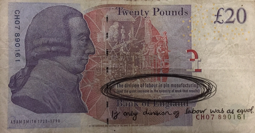
Next, I planned to take inspiration from the work of D*Face and grafitti over the money. I originally wanted to do this digitally, using stylised fonts in order to make the work look more professional – as this is my usual design style. However due to these money editing laws I was unable to do so and had to revert to defacing the notes physically. I created a large variety of designs, trying to avoid merely recreating D*Face’s designs or others similar designs that I had seen and thus make my designs more original.


Having researched capitalism I want my designs to show people that they should break free of the control of money and advertising and instead use there money for good purposes such as charities.
I scouted charity websites to find facts and figures that would show people how there money could be used better – rather than buying more clothes for example.


https://borgenproject.org/thought-provoking-facts-about-poverty-in-the-uk/
https://www.quora.com/Why-are-people-with-money-so-selfish
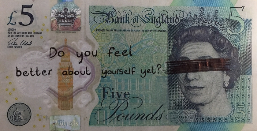
Below is a series of designs I created in response to ‘Occupy George’ with these messages in mind. i don’t think this is as effective as the campaigns designs as the notes are strong in colour and thus not very opaque meaning that writing or drawing on top of the note is not as visible as I would have liked. I originally used a black pen however I found that the red stood out slightly more.


I wrote different messages on the notes, all related to the selfishness of capitalism, trying to encourage people to spend their money in more ethical, caring ways. The messages are quite direct and cutting in order to produce emotive responses. As with the other designs I would have preferred to have created these digitally so that they would look more professional, such as with real typography, which I think makes these edits less strong.
I didn’t like the act of writing straight onto the notes as I felt my handwriting didn’t look that strong. As an alternative, I come up with the idea of using letter stamps – I think this is much more effective, reminding me more of the punk, rebellious, grafitti scene that I am taking inspiration from, such as the iconic typographical style of Christopher Wool. Due to the size of the letter stamps I wasn’t able to include as much text – however I think this makes the designs more bold and thus communicates my messages more thoroughly.


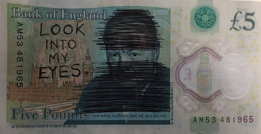
I did a photoshoot using these notes which I think look really effective as they show the emotional impact that moneys control has on individuals.


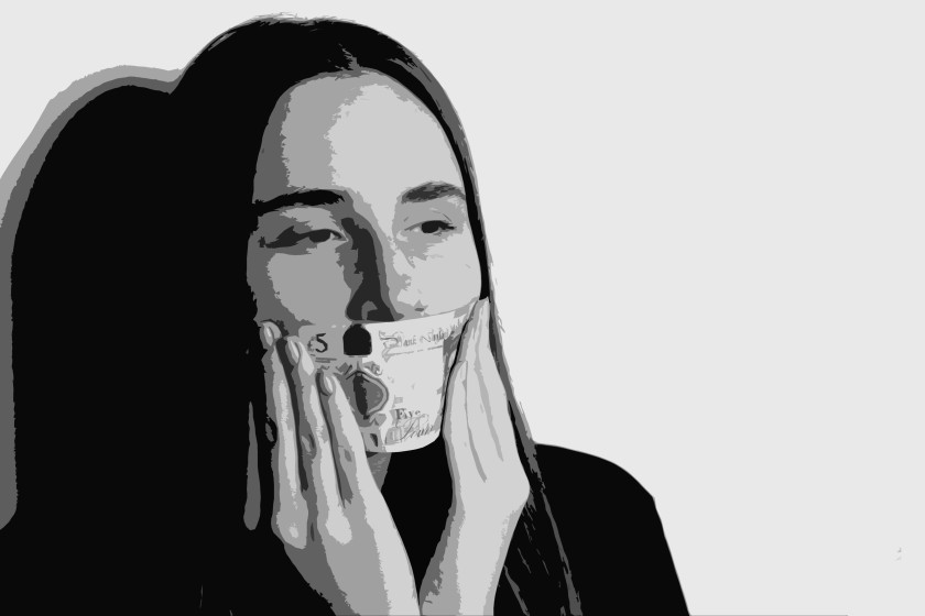
To move on from this I decided to take another photo shoot using real money. I can then edit these and play around with different slogans and taglines – which is my preferred design style.


I selected one of the most successful photos and applied a gray-scale filter – which I think embodies the notion of restriction and oppression that I am aiming to communicate. For experimentation I also tried applying filters as well as colour to just the money, to make it stand out and increase its position in the designs hierarchy but also to show the power that money has over us.


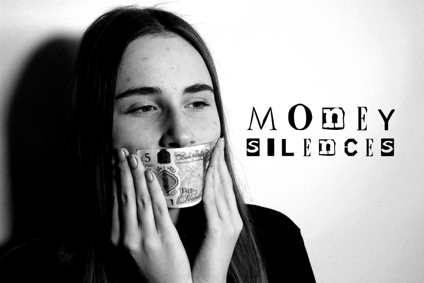
I liked the left heavy positioning of this particular photo as it allowed me to place text on the right side of the image and be left with a balanced design. I played around with typography – first using a ransom note type, Christopher Wool inspired, grungy font – however I felt that this was too stylistic.
I wanted the photograph to speak for itself and so only used limited text, such as powerful singular words such as ‘Bound’ and ‘Silenced’ that show the physical restrains that the concept of money puts on people, particularly those who do not have a lot of it.


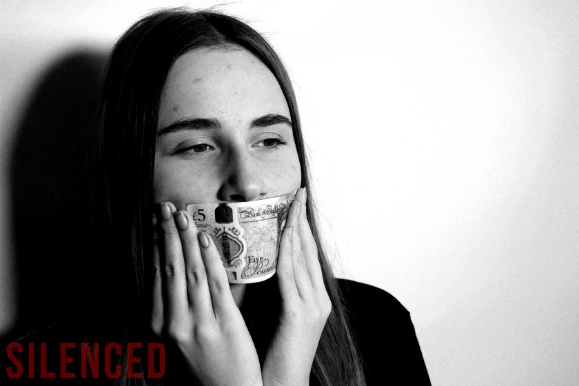
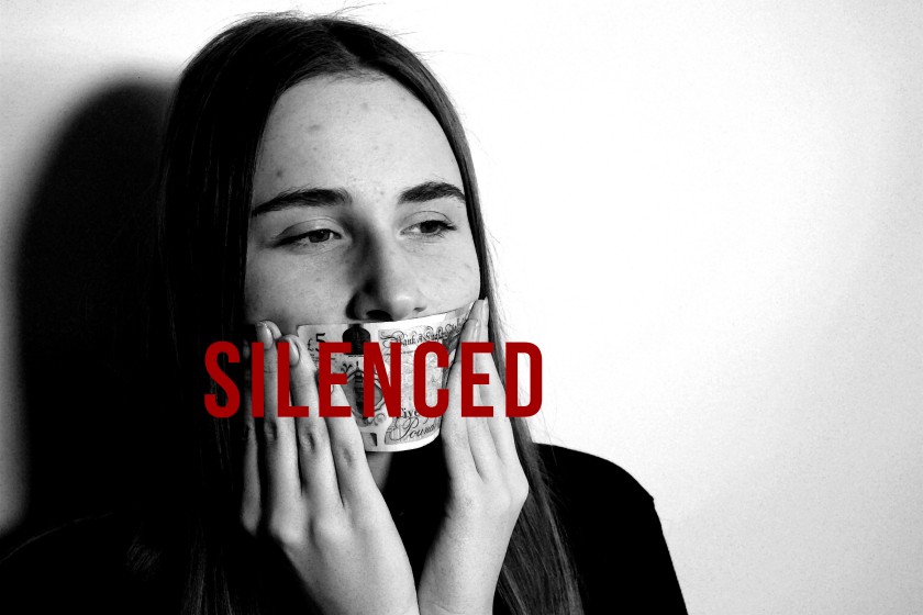
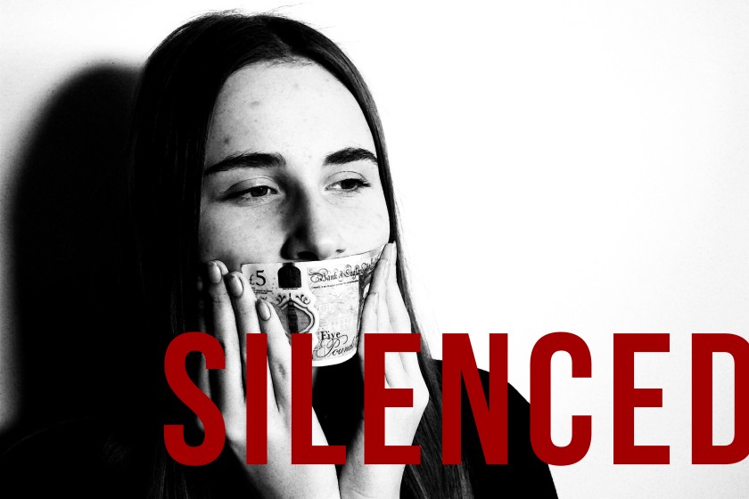
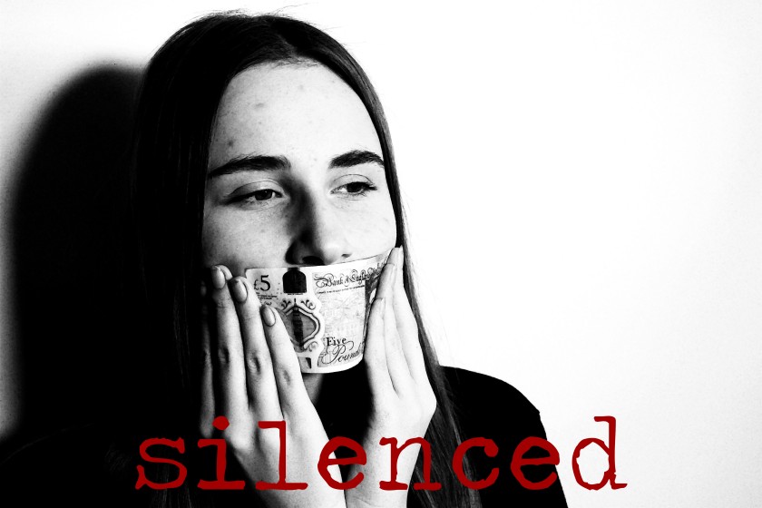
I liked incorporating the red typography into the designs, as I felt this looked really strong against the monochrome background – similar to the iconic style of Barbara Kruger. The colour red is also effective in alluding to the potential danger that money creates and the lengths people are willing to go to get it.


I felt that the slogans I was using were not intriguing or satirical enough and so I continued my research and came across a song entitled ‘We Want Your Soul’ by Adam Freeland all about the brainwashing ways of our consumerist society.
Your cell phone, your wallet, your time, your ideas
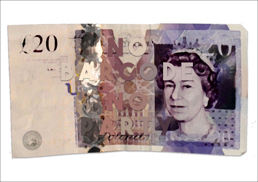
No barcode, no party, no id, no beers
Your bankcard, your license, your thoughts, your fears
No SIM-card, no disco, no photo, not hereYour blood, your sweat, your passions, your regrets
Your office, your time off, your fashions, your sex
Your pills, your grass, your tits, your ass.
Your laughs, your bones, we want it all (we want your soul)Tell us your habits, your fads, your fears
Give us your address, your shoe size, your years
Your digits, your plans, your number, your eyes
Your schedule, your desktop, your details, your life.Show us your children, your photos, your home.
Here, take credit, take insurance, take a loan.
Get a job, get a pension, get a haircut, get a suit.
Play the lottery, play football, play the field, snort some tootWe’ll show you shrinks, we’ll show you spooks,
We’ll buy you drinks, throw away your books
We’ll sell you crap, we’ll charge you tax,
We’re out buying big guns and you’ll front the cash (we want your soul)We want your soul
Your thoughts, your emotions, your love, your dreams
Your cheque book, your essence, your sweat, your screams
Your security, your sobriety, your innocence, your society
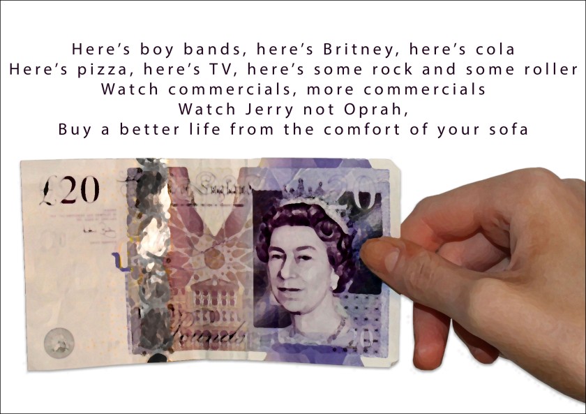
Yourself, your place, your distance, your spaceHere’s boy bands, here’s Mackers, here’s Britney, here’s cola
Here’s pizza, here’s TV, here’s some rock and some roller
Watch commercials, more commercials, watch Jerry, not Oprah
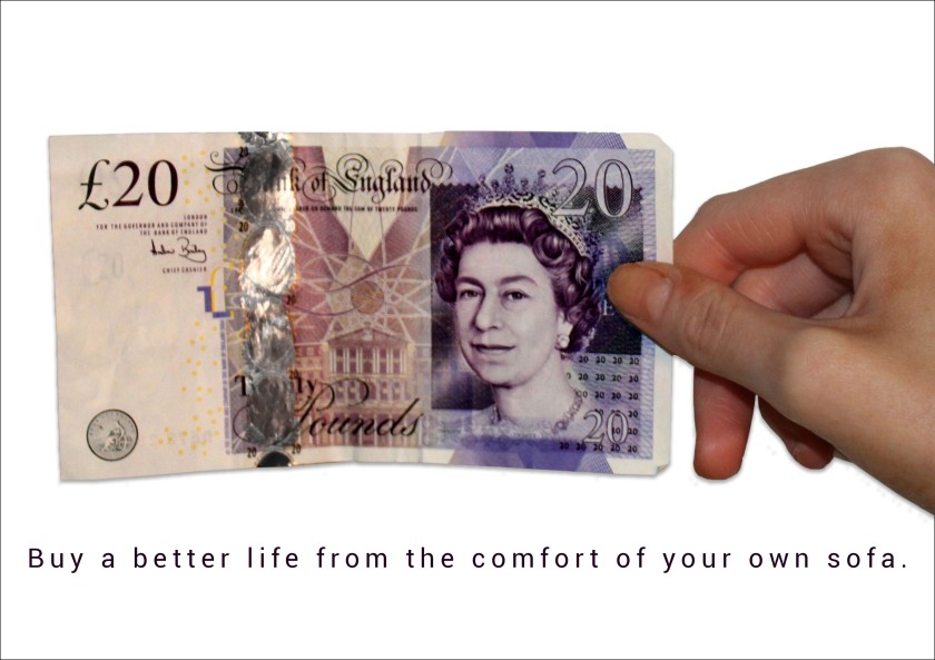
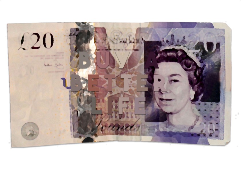
Buy a better life from the comfort of your sofa
Here’s popcorn, here’s magazines, here’s milkshakes, here’s blue jeans
Here’s padded bras, here’s armpit wax, here’s football shirts, here’s baseball caps
Here’s live talk-shows, here’s video games, here’s cola-lite, here’s ten more lanes
Here’s filter-tips, here’s collagen lips, here’s all-night malls, here’s plastic hips (we want your soul)Your cash, your house, your phone, your life (we want your soul)
No hippies, no strays, no drop-outs, no gays
No lefties, no loonies, no opinions, no way
No thinkers, no teachers, no facts, no freaks
No skaters, no tweekers, no truth, no sleepYour cash, your house, your phone, your life (we want your soul)
The song is really cutting and satirical and forces us to pay attention to all the different ways we are controlled within society – from adverts to entertainment to loans etc. I thought quotes from these would work perfectly within my designs.
I used the photographs of just the money and edited them against a plain white background. I used a very simple and understated font ‘Roboto’ as I felt this also mimicked fonts regularly seen on older TV adverts and computers as well as that of terms and conditions – all linking closely with my brief.


I liked these but I still felt there was something missing about them, something about the white background against the hand looked harsh and unnatural to me. In order to fix this I used the stamp tool to remove the hand from the notes.
With these edits below I reverted to ‘The Bold Font’ in white over the notes – I think this looks much stronger and is closer to my normal design style.


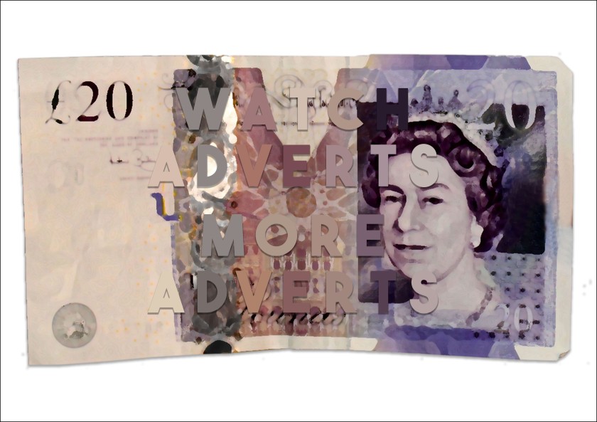
I then experimented with changing the colour of the different letters, for these edits I used the colour picker tool to select really similar colours so that the words faded illegibly into the background.
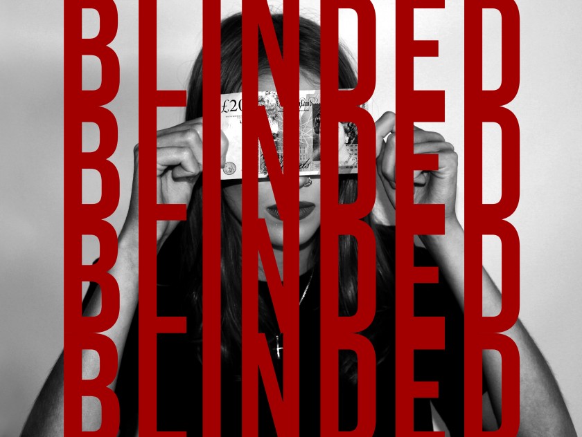
I wanted to achieve this effect where you really have to look at the designs to read what it says in order to reflect the way that we are all blinded by money and when you actually think about it and take a closer look you realise all the ways in which we are controlled by money.
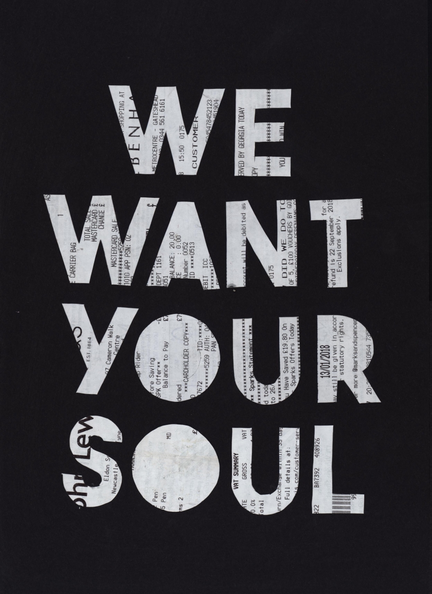
I then decided to progress from experimenting with money and moved my focus to receipts. I like the mundane, everyday simpleness of receipts, feeling they were an effective symbol of capitalism and the tight control that money has over us. I found it scarily easy to obtain hundreds of receipts to start experimenting with – showing the way that we as a society struggle to live without buying things and spending money – whether that be necessities like groceries or luxuries like accessories and entertainment, we don’t seem to realise the state of false consciousness that we live in.
I also enjoyed working with physical receipts too as I think there is something really raw and beautiful in the crumples, discolourment and fading that insinuate the stories of the receipts use and afters.
I felt there was still progress to be made using the song lyrics as quotes so I revisited this by using a stanley knife and typography stencils against the receipts. When using the sharp knife I used a safety board and was careful with the blade against my own skin and that of those around me whilst performing the activity.


I placed the cut out receipts against coloured backgrounds which helped to make the emotive powerful words really stand out.
Once all the receipts had been cut out I created further experimentations by placing them into the photocopier. I really admire the pixellated, digital effect that this adds to the designs.
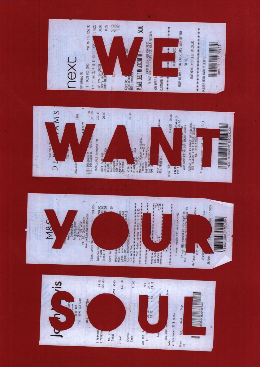
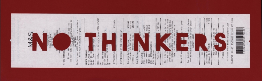
As well as cutting out singular words onto the receipts, I also included whole slogans which I think is even more effective. i used quotes that focus on the act of buying things in order to link to the medium choice successfully. I like the imperfect and edgy finish that cutting the letters by hand produced as I feel it adds to the rebellion, grungy feel of the designs – reminiscent of the DADA movement.
I also like the strength of the block coloured backgrounds – I tried purposefully selecting certain colours due to the symbolism they could bring to the designs such as red symbolising the imminent danger of capitalism and green eliciting the idea of money as well as jealousy and greed.


I quite like the way that the receipts look as multiple sets of three and four like shown above – this makes me think of the pop art movement, especially with the use of the bright colours. This could influence how I showcase my designs within the final exhibition.


With the individual letters cut out of the receipts I decided to create further edits. I think these are also incredibly strong but in a more implicit way – as it is not immediately obvious that the words on the paper form receipts. I like this quality though as I feel it will intrigue my audience. I really like the way these look against the black backgrounds.


Concept 1 Evaluation:
Overall I am extremely pleased with the way I have responded to my first concept and the work that I have produced for it. I started the concept with a heavy amount of artist research – looking at influential designers that linked to the theme of money but also their motivations behind there work as well as contextual research such as current affairs that show how topical and relevant this investigation really is.
I produces a wide range of experimentation, starting with scannograms, before moving onto physical manipulations of money, photoshoots and digital edits and finally physical manipulations of receipts. I am really pleased with the amount of work I have produced for this concept and the range of ideas and beliefs I have been able to explore within it. The majority of my experimentation has been physical, which I think makes my work much more sophisticated and is refining my style as a designer. I think this links well to the brief and overlying theme of my project, linking to the rebellious, grungy movements.
From tutorials I was given the feedback that some of my earlier designs were to explicit and did not require my audience to need to think about the messages for themselves at all. I believe this is something I think I resolved effectively towards the end of the project – using the secondary source of the song to provide me with quotes to embed within my designs to make them more intellectually inquiring and intriguing. This shows me how important it is to continue to have regular tutorials with professionals and peers to avoid wasting any time on designs that are not as successful – so this is something I will continue to do within my practice.
My initial idea for my exhibition installation piece is to include my strongest pieces from each concept and create a barbed wire wall full of designs, similar to the graffitied nature of the Berlin Wall. Therefore, if this does not change, I am most likely to use the later digital money edits that combined the song quotes, or the receipt posters – as I feel these were the most successful and would most likely communicate the strong, important messages that I am trying to. I also think these could be easily made into interesting merchandise pieces that I think people would be willing to buy at the exhibition shop.
Following on from this first concept ‘Money Money Money’, I think I would like to look at specific rules and regulations within society that control us – as I feel this would carry a more direct link to the overall theme of control which is something I am keen to look closer at. This is something I am interested in exploring further and think would make an intriguing and comical concept.
